Our Client
Whitney R. McGuire is an attorney specializing in intellectual property and other legal issues affecting creative industries, such as fashion, film, art, and music.
“Where to begin? Jane is a true artist with coding. She was able to interpret my ideas and execute them flawlessly. I needed a professional website that showed my creative personality and she nailed it! She was never short on ideas/examples from which to draw inspiration. She communicates very well and informed me of each stage of progress so I could budget accordingly. I LOVE my website! And I’ve gotten so much great feedback already. Thank you, JANE!”
What We Did
Logo Design
Website Design
Website Development
Animation
creative process
Mood Boarding:
Majestic is the Vibe
The first step of any creative project is to define the vision. To get the design right, it’s crucial that we’re aligned on communicating the right message, feeling, and aesthetic that authentically reflects the brand.
Kick-Off Meeting
CPF interviewed Whitney to get a clear understanding of her goals and vision for her website. What content did she imagine would live on her site? What messaging did she want to communicate?
Mood Board
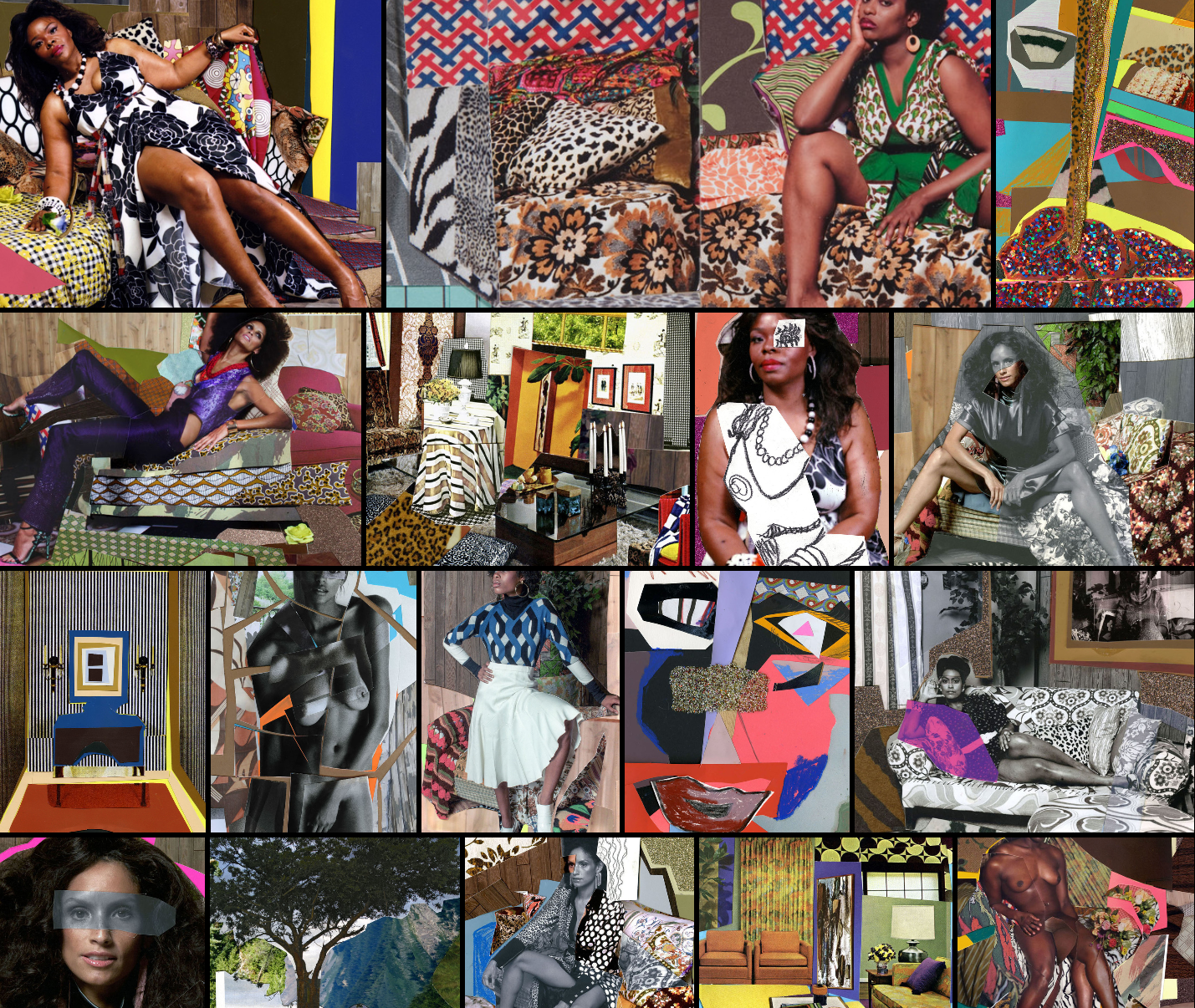
A mood board is super helpful to visualize the intended style, emotion, and feeling of a design. The goal of her site was to convey that she was a lawyer for creatives, so her mood board naturally included works by artists Nina Chanel Abney and Mickalene Thomas. CPF also included a collage Whitney made for her website design.
Content Map
Our content map documented all of the content (text, photos, videos, links, forms, etc.) that should be included on the website. As Whitey is a lawyer, she naturally wrote all of the website copy including:
a summary of her professional history
her background
a timeline about how she got to where she was
a list of links to other projects, associations, work, and an interview
Design
Designing the logo and website concept
I started designing Whitney’s website by selecting type faces for her logo. I loved the blue background Whitney picked for her collage design. That blue felt reflective of her qualities - regal and wise. I picked a font that showcased her initials WM in a way that reminded me of mountains, which aligned with the regal and wise intention of the color selection.
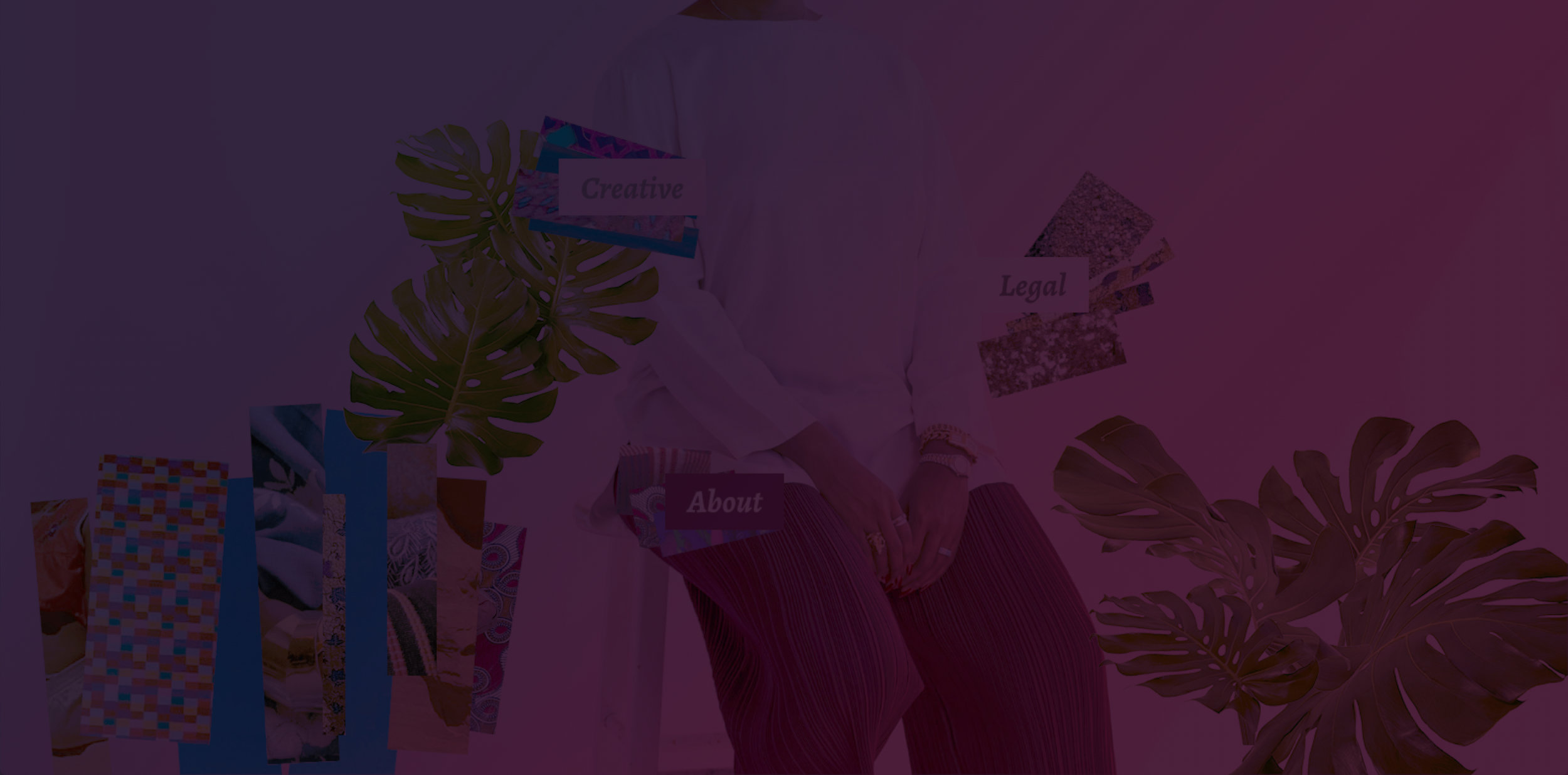
To create her website design, I pulled a photo from her latest photoshoot. I selected this photo to design around because her expression, posture, and impeccable styling felt the most majestic, which aligned nicely with her logo.
Except for the monstera leaves (which are from Adobe Stock), I pulled all the images directly from her Instagram profile. As a creative, Whitney’s sharp eye and her aesthetic are very clearly defined in her content.
Development
Bringing it to life with animation
Once Whitney and I reviewed the design mock up together, I purchased the stock photos and got started on coding the website. I was eager to animate the design as a way to really underscore the message that Whitney was a lawyer for creatives.
Here’s how the design really came to life with animation:


