Our Client
With the aesthetic of a boutique studio, Fancy Hands Massage offers holistic massage therapy all wrapped up in the completely individual package that is Rebecca Clark, LMT.
What We Did
Branding Style Guide
Logo Design
Website Copy
Design Style Guide
Website Design
Style Guide
Defining Visual & Written Rules for the Brand
To create alignment between Color Plus Form and Fancy Hands Massage, we started with a series of consultations to deepen our understanding of the brand voice by:
Clarifying the vision
Creating a mood board to visually explore inspiration themes
Compiling potential interactive concepts and style treatments
In our first consultation, some of the key points and themes we wanted to highlight in the Fancy Hands Massage brand included:
holistic healing & wellness
editorial with splashes of tasteful rainbow bright
sensory movement and flow
customized experiences
luxury with edge
Mood Board:
The Style Guide defines the brand’s tone of voice and personality and includes the mission statement, tagline, and phrases that could be utilized in something like an Instagram bio.
Mission Statement: Holistic massage therapy by the distinctly manicured Rebecca Clark, LMT
Tagline: 💎 Wellness to inspire greatness. 💎
Logo Design
Evolution of the Design Concepts
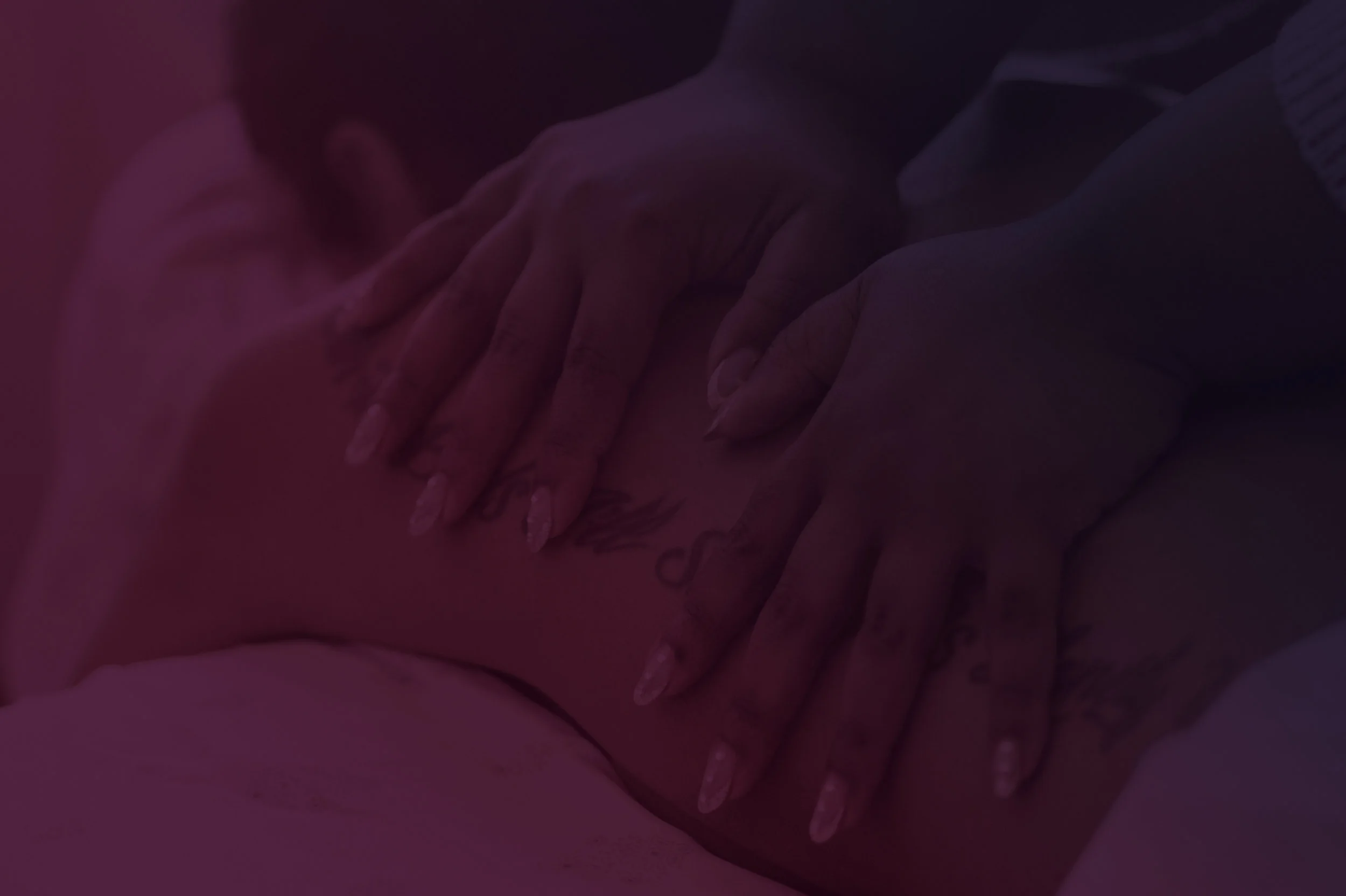
For the first logo iteration, Rebecca sent inspiration image in the form of interior spaces designed in the Hollywood Regency style. Here’s a side by side of the inspiration pictures from Rebecca and how the first logo drafts came out:
Here are a few photos Rebecca sent us of Hollywood Regency interior design that reflects her personal style.
This logo draft pulled inspiration from the lines and form of the art deco style and the vibes of Hollywood glamour.
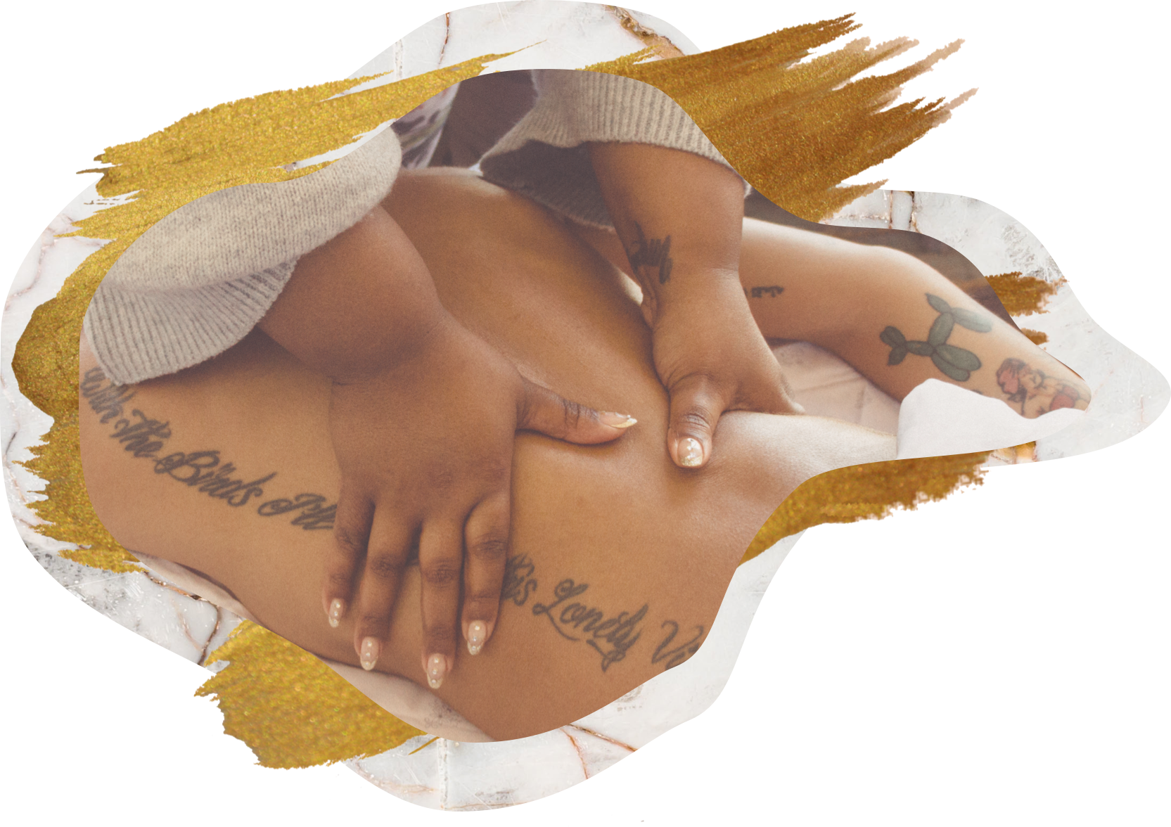
This logo draft features a more wabi-sabi shape as opposed to the art deco style frame in the initial draft. This version felt more organic and inline with the wellness and movement aspects of the Fancy Hands brand.
Rebecca preferred the wabi-sabi version as it felt more in-line with her brand. We continued to iterate on the design specifically to bring in some of the other key elements of the brand. To reflect the custom and luxury aspects of the Fancy Hands Massage experience, we brought in a marble background. To feel more editorial, we toned down the colors utilizing only the red nails and bronze brushed hands to keep it clean with just “splashes of rainbow bright.”
Here’s how her two final options came out:
We ended up choosing the “light” theme version which felt more in line with the holistic wellness aspect of the brand. For the final version of the logo, we refined the chosen concept in terms of proportions, form, and spacing and offered two versions - one with “Massage Therapy” and one without.
Website Design
Creating the Design System
To keep in line with the logo design, we created visual styling elements that could utilized in a variety of ways on the site including gold brush strokes, the marble background from the logo, more wavy wabi-sabi style shapes, and rose gold metallic lines. Here’s a sampling of how some of those elements came together:

Fonts used included Playfair Display for headlines and Montserrat for titles and body copy. We pulled in rose gold for the customized herbal flowers and plants icon set.

Launch
Website Rollout in Phases
Prior to working on the website design, we knew Rebecca needed a landing page that gave her potential customers a quick way to find her services, rates, and contact information. We launched this landing page prior to working on the full website rollout. More details on that coming soon!
